01
The problem
The brand is the product
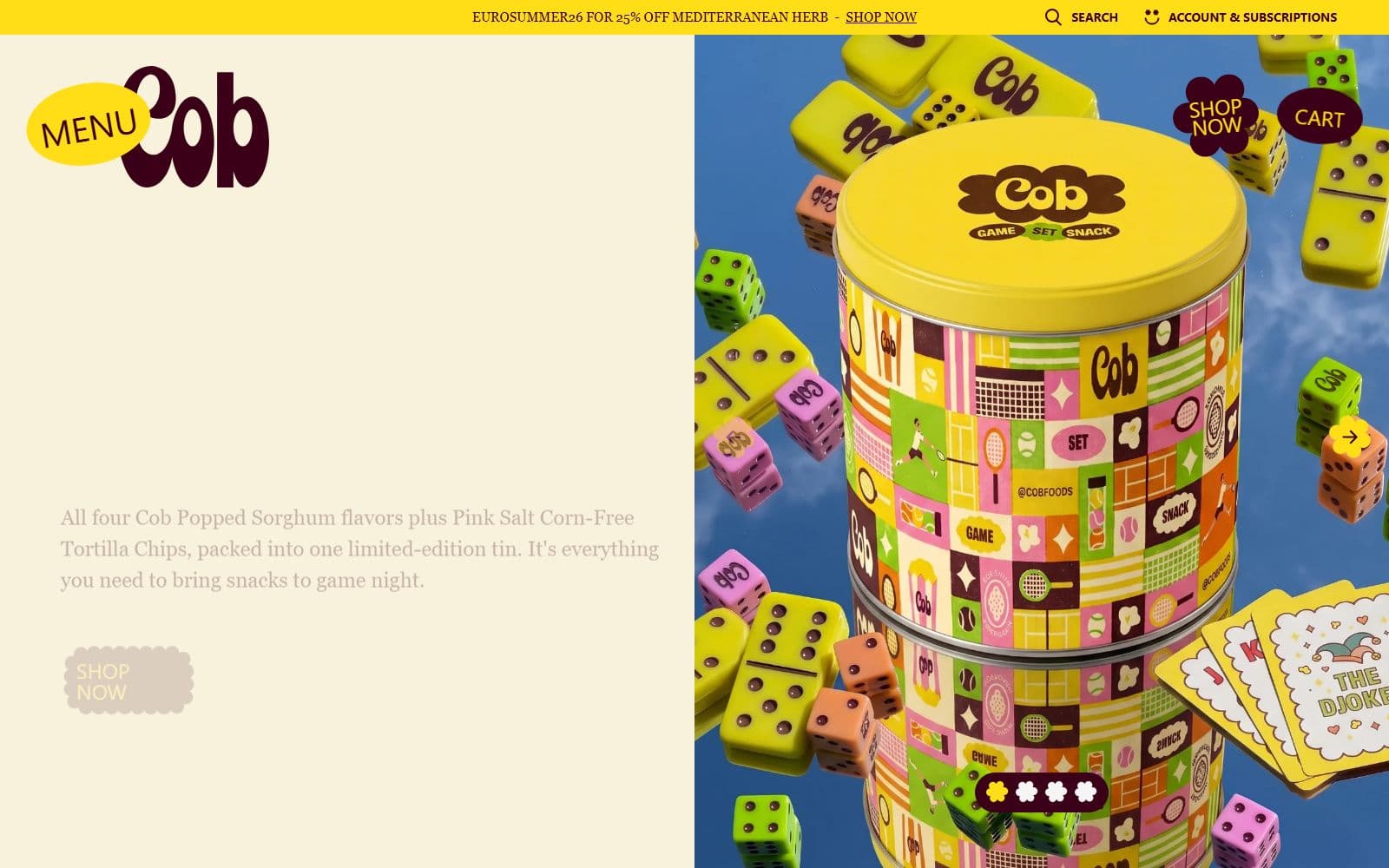
Cob sells popped sorghum snacks into a category where the packaging does most of the selling. The identity is deliberately loud: a fat rounded wordmark, a cream and yellow palette, illustrated tins and a split-screen layout that puts the product photography against flat colour.
That is the kind of design that a theme-store theme quietly flattens. Every section you cannot control becomes a compromise, and after enough compromises the site stops looking like the brand at all.